Building
The Blurmot
Brand
CASE STUDY
BLUR MOTION
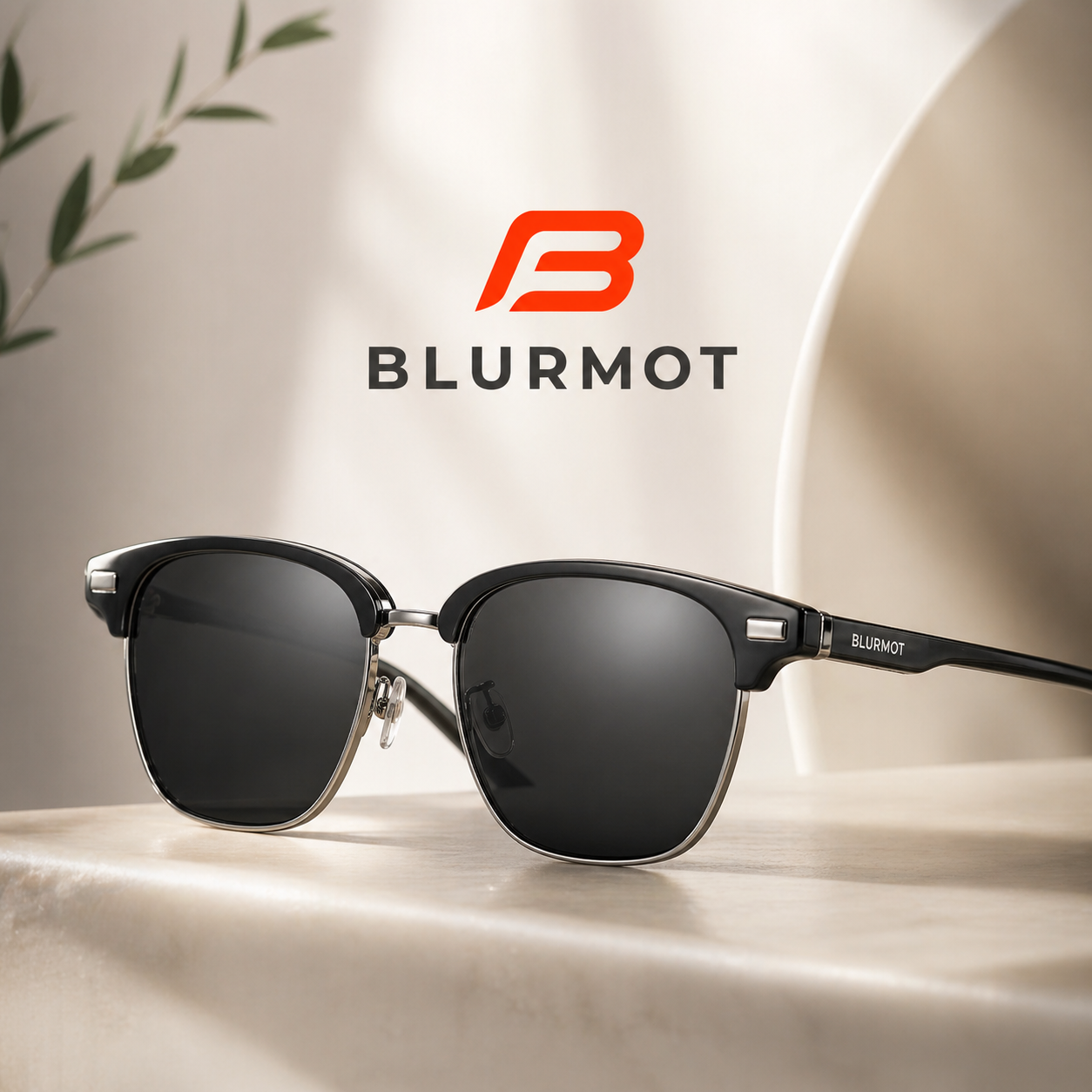
Blurmot is an eyewear brand built around a simple idea glasses should look good, feel good, and work well without being overpriced. The goal was to create a modern and cohesive brand that moves naturally between sport, outdoor activity, everyday life, and more refined styles.
The project combines brand strategy, visual identity, product design direction, packaging, photography, AI-generated content, e-commerce, and advertising into one consistent system. Every decision focuses on what matters most to the customer clear vision, accurate colors, comfortable fit, flexible construction, reliable materials, and clean modern design.
Blurmot is positioned as accessible premium eyewear, functional, stylish, well made, and priced to make sense.
CASE STUDY
GLASSES COMPANY
Engraving
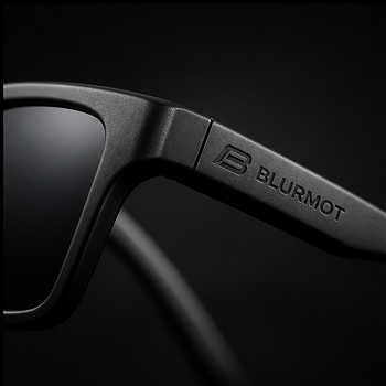
Product (engraving, frames) The identity had to function at micro scale engraved on lenses and frames of different sizes requiring a bold, simplified mark that stays readable and premium under extreme constraints.
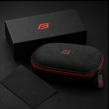
Packaging
Packaging (box, case, accessories) Design needed to translate into a physical premium experience, maintaining consistency across materials while reinforcing durability, precision, and clean aesthetics.
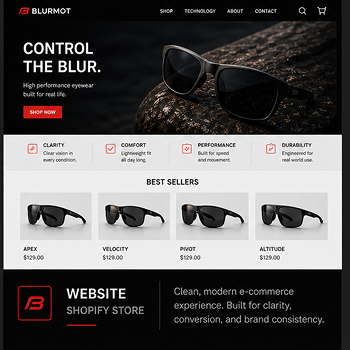
Digital
Digital (web, ads, social) The system had to scale into high impact visuals, keeping clarity, contrast, and recognition across fast scrolling environments and different formats.
SOLUTION
The solution was a minimal but performance oriented identity system built around structure, motion, precision, and visual control.
The brand language combines:
– simplified geometric forms
– clean typography
– controlled spacing
– cinematic product presentation
– modern digital layouts
This allowed Blurmot to maintain a consistent premium feel
Brand Purpose
Blurmot exists to help people see clearly and move confidently in everyday life.
The brand combines modern design with technical precision to deliver clear lenses, accurate colors, flexible construction, and all day comfort .
Positioning
Accessible premium eyewear focused on performance where it matters.
Not cheap. Not overcomplicated. Just well made products designed to perform consistently while maintaining a refined modern appearance.
Blurmot operates
- performance sport eyewear
- lifestyle minimalism
- technical product design
Target Audience
Modern, active individuals aged 20–55 who value:
- functionality
- clean aesthetics
- comfort
- versatility
The audience moves between
- outdoor activity
- cycling
- driving
- travel
- everyday urban environments
Logo Design
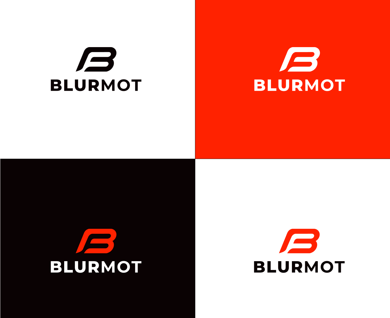
The Blurmot logo was designed as a minimal, high recognition mark built around a simplified dynamic “B”.
The symbol reflects:
- motion
- forward direction
- speed
- precision
- controlled energy
The shape subtly resembles a racing line or forward path, reinforcing movement and performance without becoming visually aggressive.
Scalability & Functionality
A key requirement was versatility across physical and digital applications.
The logo needed to perform consistently on:
- frame engraving
- lens applications
- accessories
- packaging
- apparel
- website interfaces
- social media content
The bold construction ensures legibility at extremely small sizes while maintaining a premium feel at larger scales.
SOCIAL MEDIA
Challenge
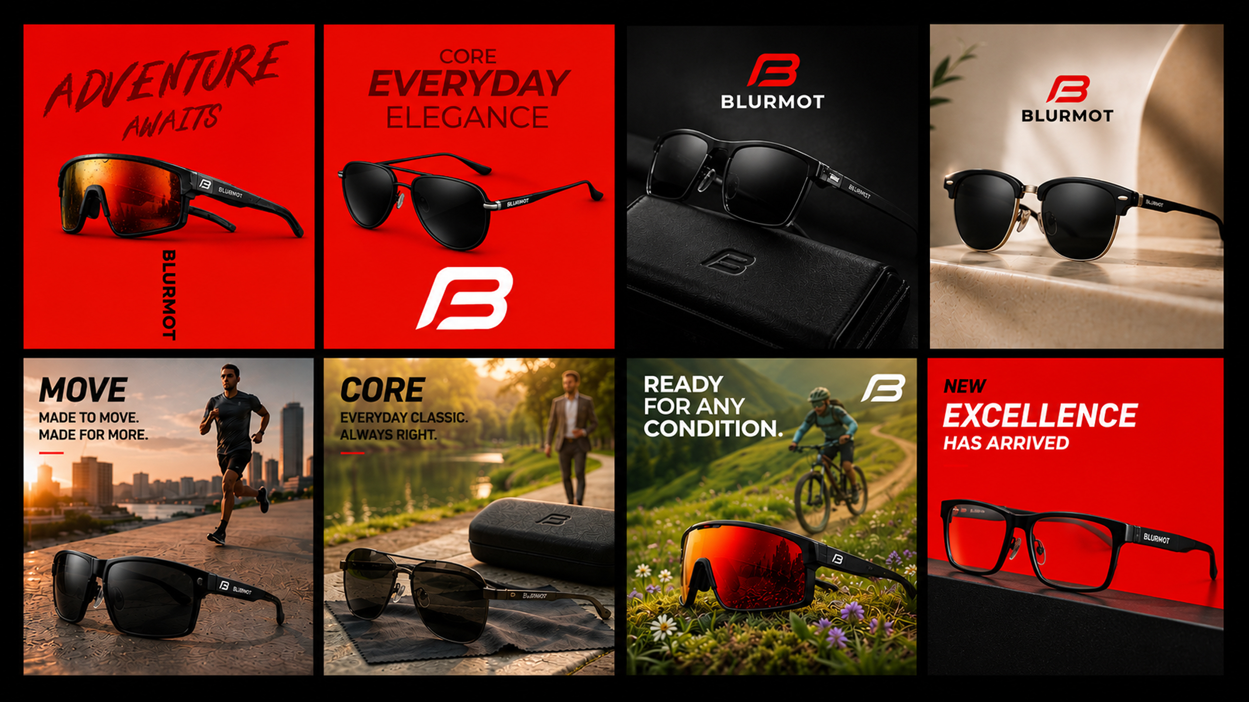
Create a social media system that could support product launches, brand awareness, and daily content while maintaining a consistent visual identity across all channels.
Approach
A flexible content framework was developed using the BlurMot visual system, combining product photography, lifestyle imagery, performance focused messaging, and brand storytelling. The goal was to create content that could scale across Instagram, Facebook, paid advertising, website banners, and future campaigns.
Post
YouTube
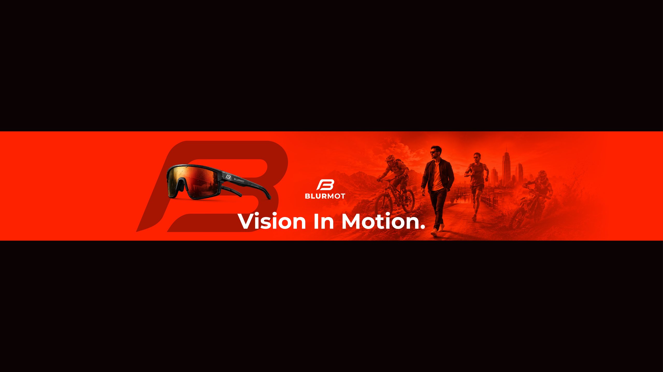
PRODUCT PHOTOGRAPHY > DESIGN
Challenge
The product photography process began with studio images that required extensive postproduction. I removed dust, reflections, imperfections, and background distractions while enhancing lighting, materials, and color accuracy to achieve a premium commercial finish suitable for print, digital campaigns, and online retail.
Result
Using the retouched photography, I developed a complete visual system including campaign concepts, social media creatives, product launches, digital advertisements, website sections, email marketing, and branded marketing materials. Each asset followed the same design system to ensure consistency across every platform.
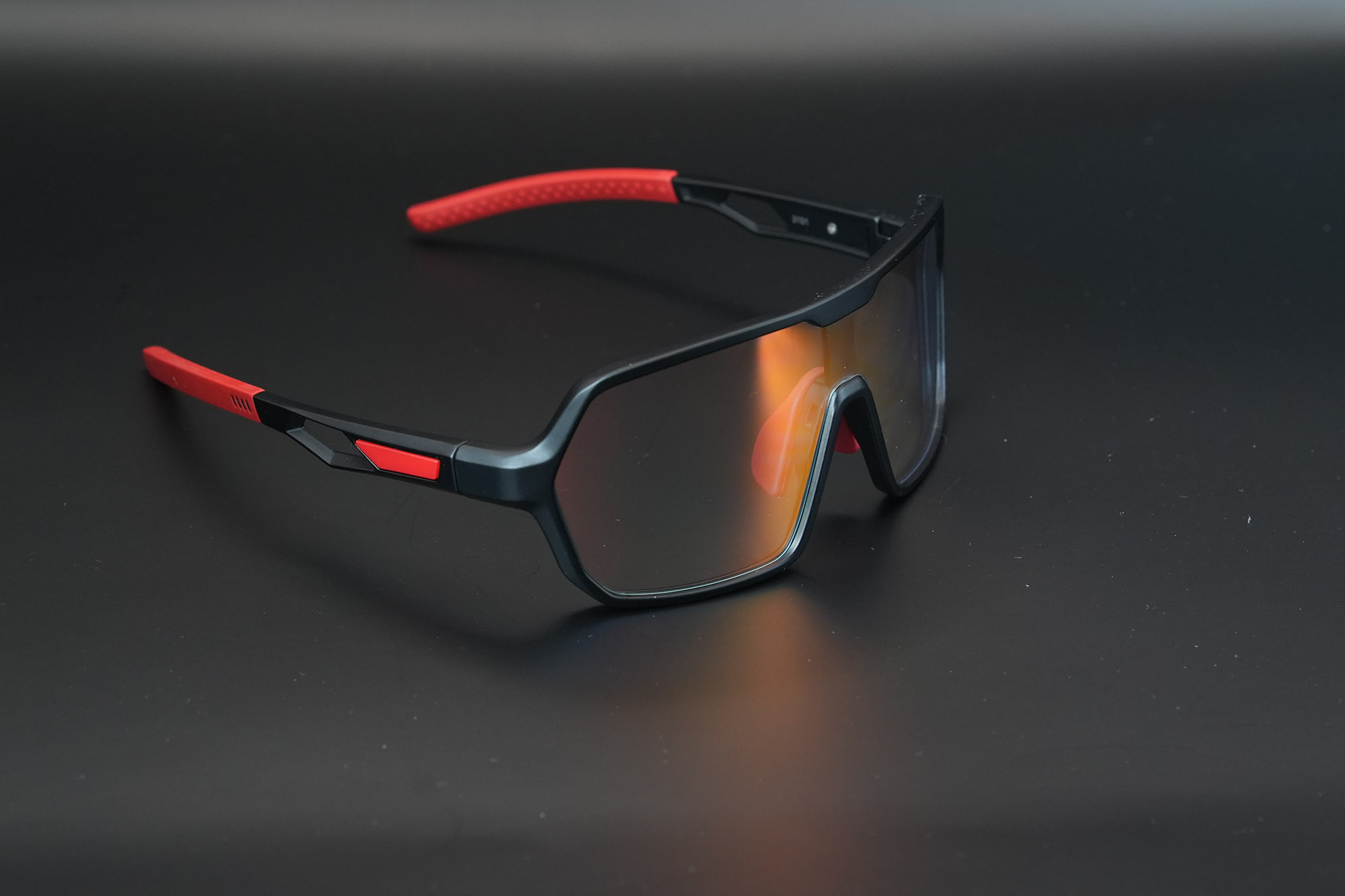
Original Image
Shot by Sony A7IV + 85mm F1.4
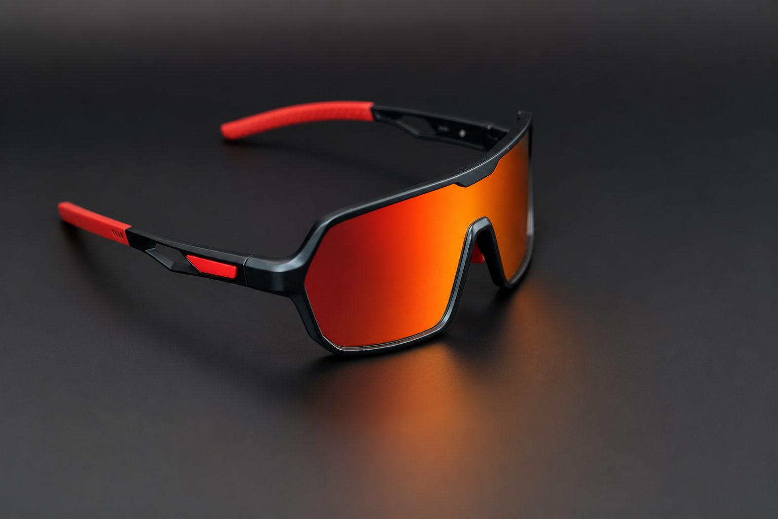
Full retouch, cleaning, Color grading, and
visual correction representing a realistic look and visual experience.
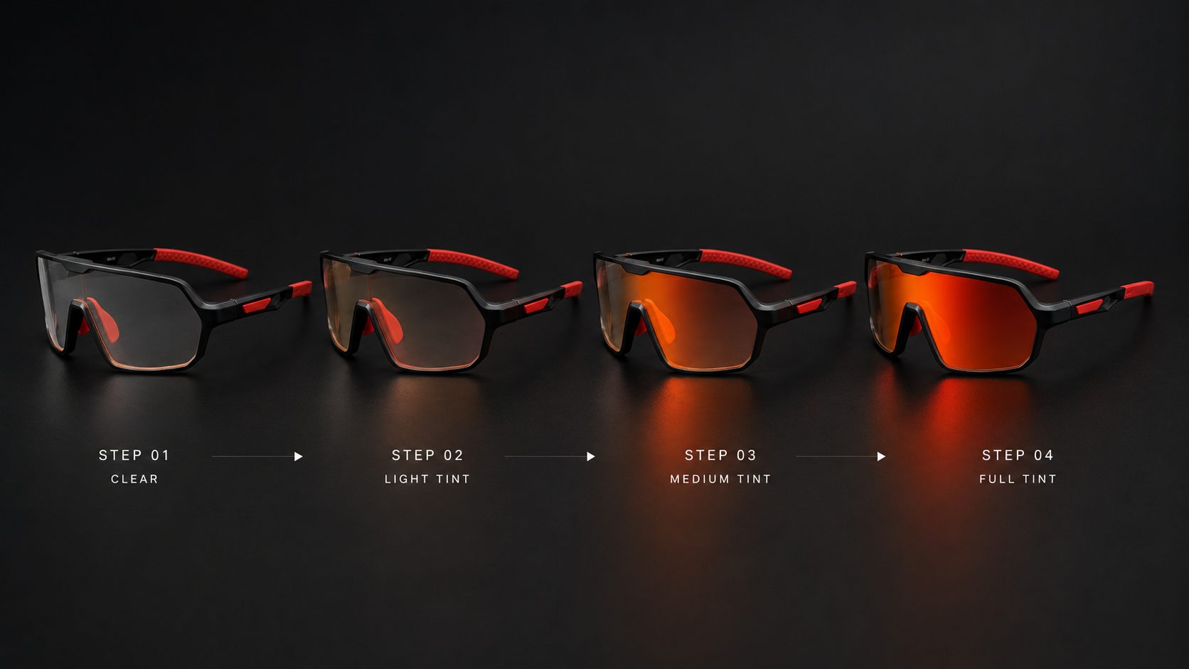
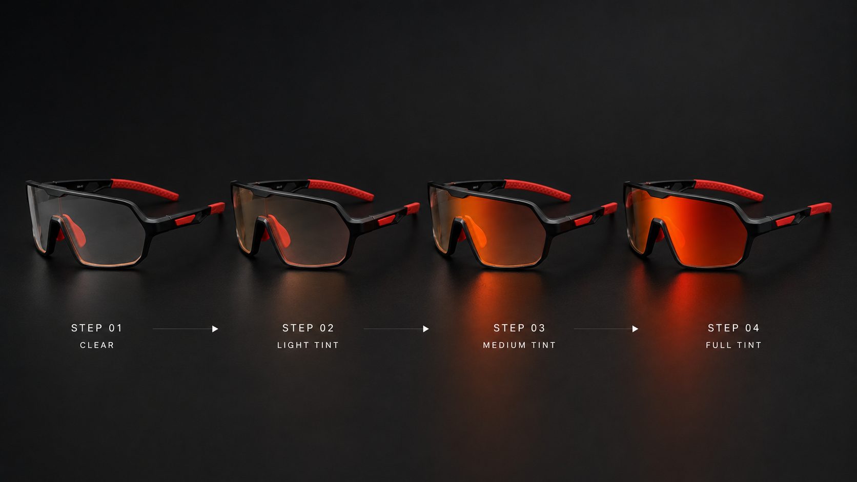
Visualizing the transition from clear lenses to full UV activation under increasing sunlight.
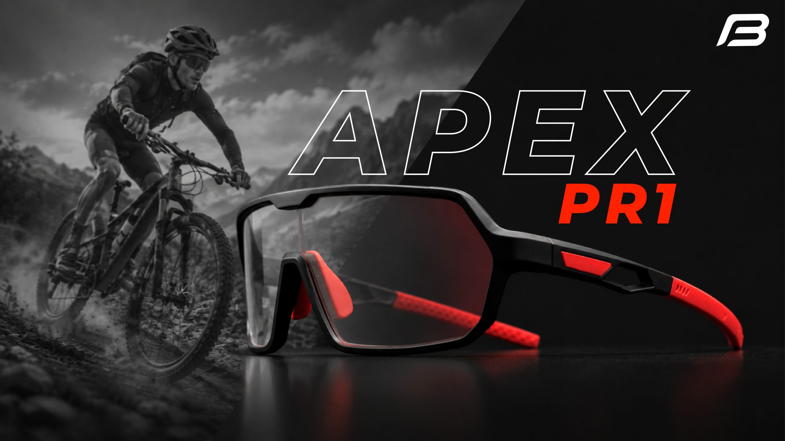
A final marketing composition developed from the edited product photography,
designed to showcase the Apex PR1 within its intended environment and establish a strong visual direction for future campaigns.
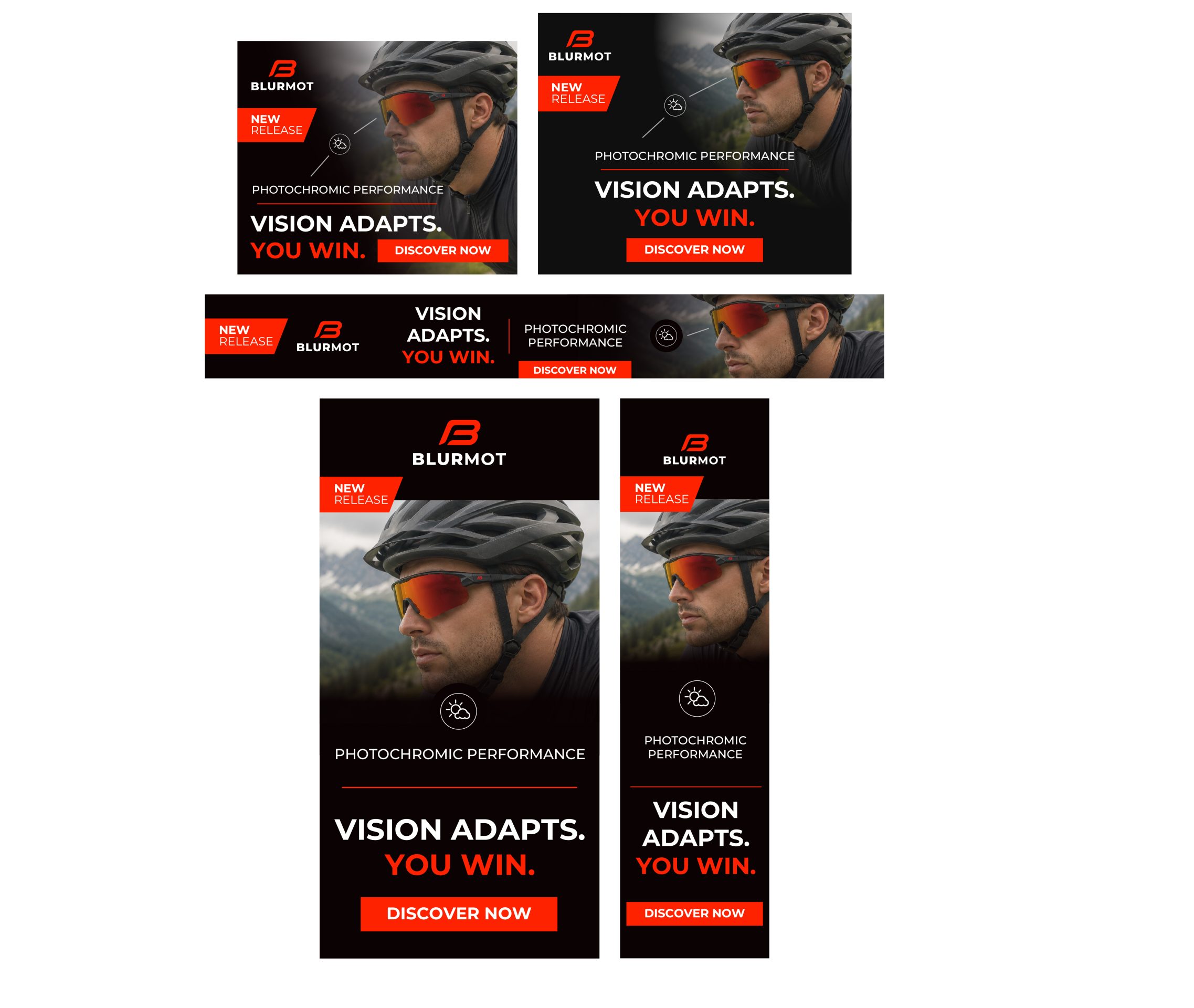
Google Ads — Campaign Adaptation
The New Release Key Visual was adapted across multiple Google Ads formats while maintaining a consistent BlurMot identity. Each layout was optimized for different placements, screen sizes, and visibility.
AI Generated Content
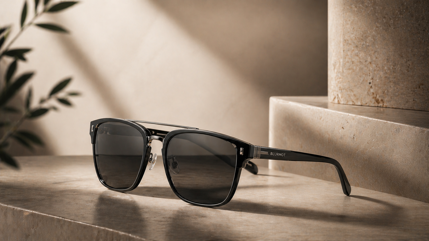
For Blurmot, I explored how AI Generated content could become part of the brand’s visual marketing system.
I developed campaign imagery, lifestyle photography, product visuals, and digital advertising
concepts that place the eyewear in realistic environments while maintaining a consistent brand identity.
The approach combines AI generation with art direction, branding, and traditional design, allowing
Blurmot to produce High Quality campaign assets quickly and adapt them across social media, digital advertising, e-commerce, and product launches.