Building
The Christina’s
Churros
Brand
CASE STUDY
CHRISTINA’S CHURROS
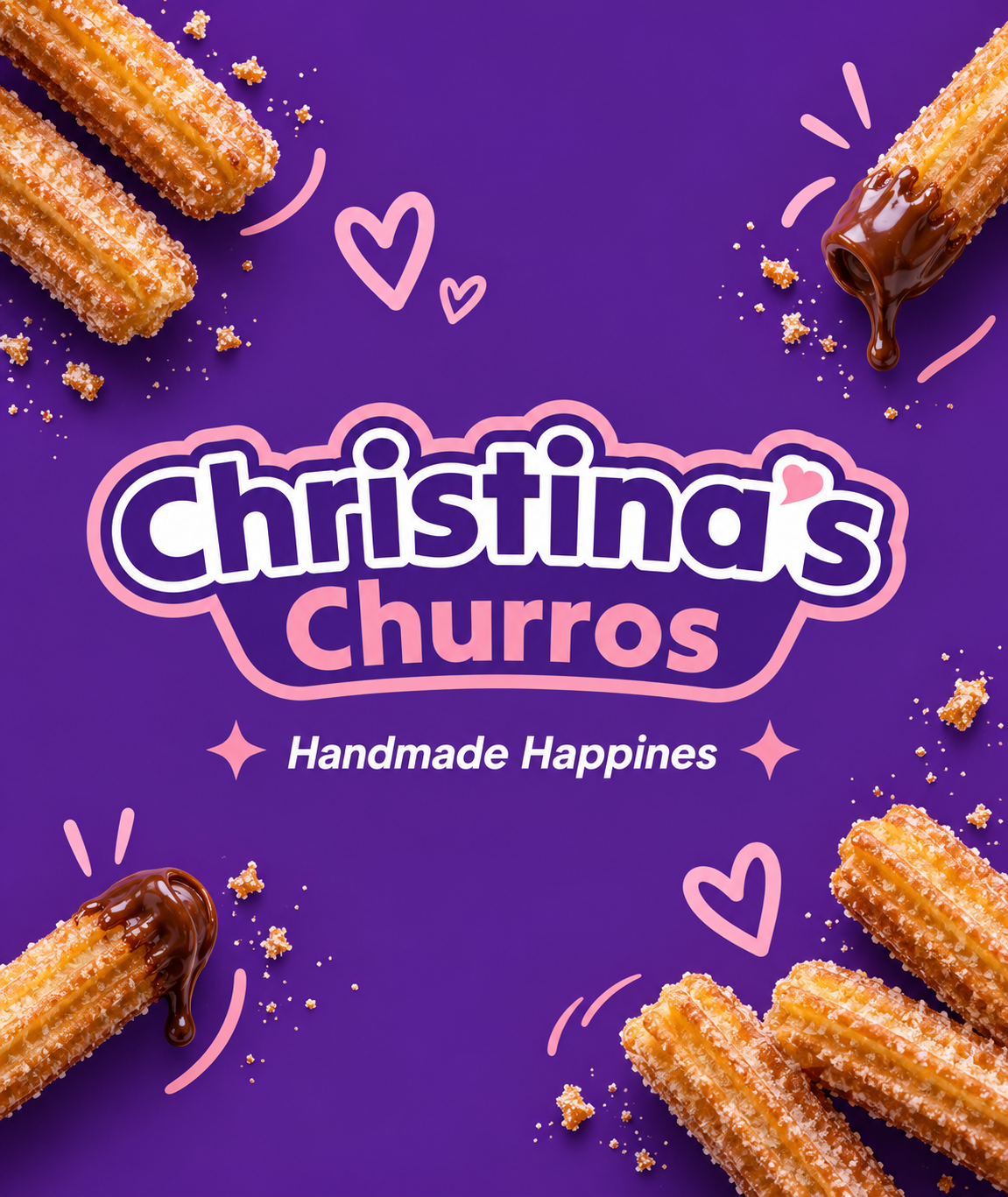
Christina’s Churros is a handcrafted churro brand built around one simple idea: turning a familiar treat into a joyful, memorable experience.
The goal was to create a visual identity that feels fun, warm, handmade, and instantly recognizable, while still looking professional enough to grow across a food truck, packaging, social media, signage, merchandise, and future retail applications.
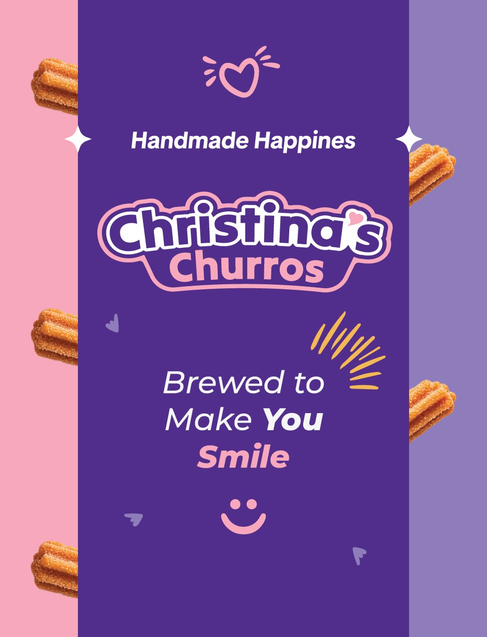
The brand combines bold purple, playful pink, expressive typography, and distinctive graphic elements to create an identity that feels energetic and approachable. Every element is designed to communicate the same message: fresh churros, handmade with care, made to make people happy.
From the logo to the packaging and visual communication, the entire system was designed to make Christina’s Churros feel like more than a dessert, a brand people remember.
Logo Creation Process
Christina had a clear vision from the start simple, playful, and colorful. Because the direction was already well defined, the logo came together very quickly we explored a few ideas, refined the strongest one, and arrived at the final look in a short, focused process
SMALL BRAND GUIDE
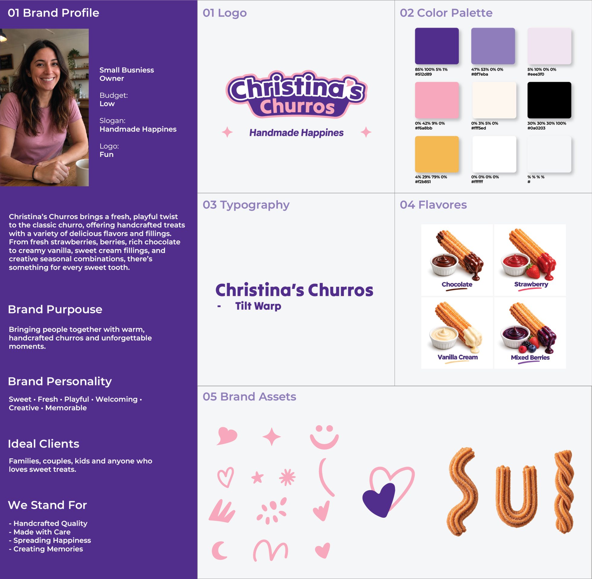
Christina had a clear vision from the beginning. She wanted the brand to feel simple, playful, colorful, and approachable, with an easy to recognize logo, a broad color palette, and playful brand doodles such as hearts, sparkles, strokes, and other hand drawn elements.
My main goal was to define the logo, color palette, typography, doodle style, and overall visual direction, while also understanding Christina, her business, her customers, and what she wanted the brand to communicate.
Based on that information, I created a simple, focused brand guide that gives Christina a clear visual foundation and helps keep future designs consistent.
BRAND COLLATERAL
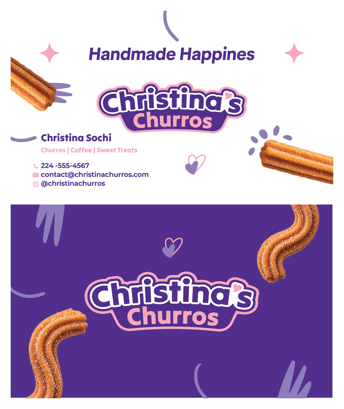
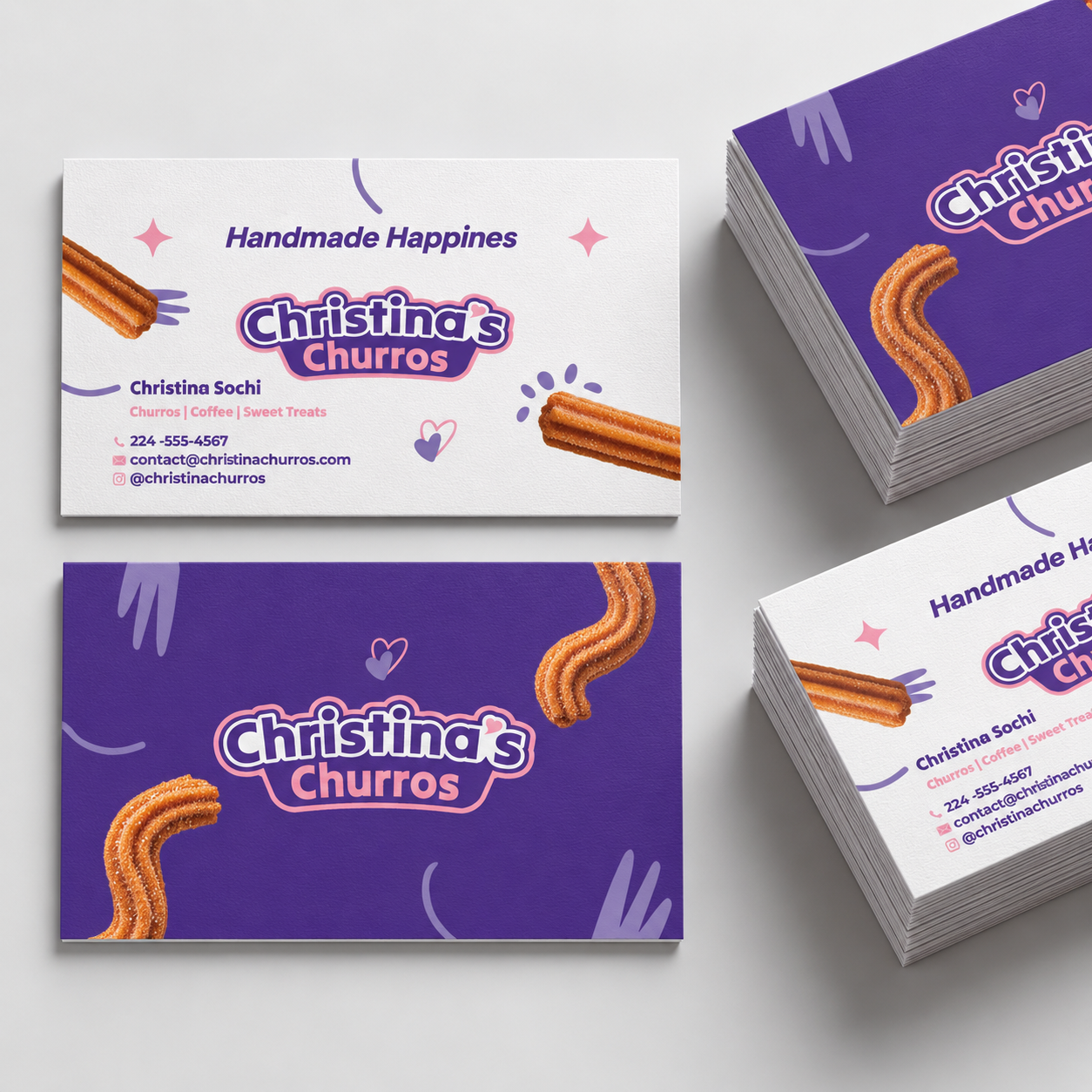
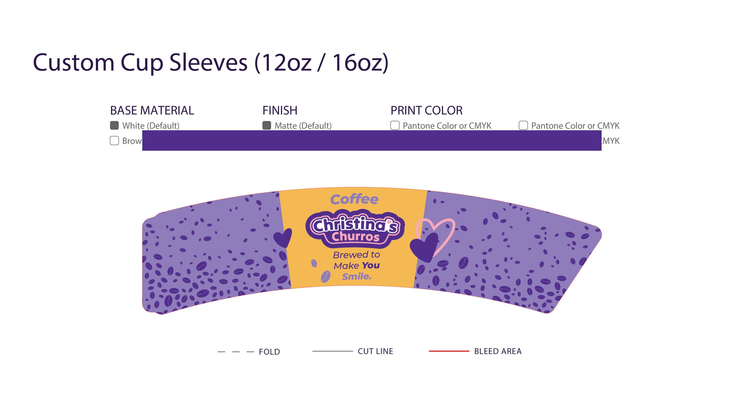
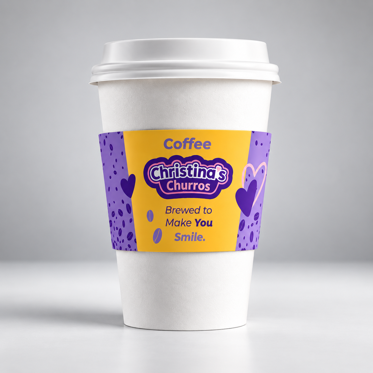
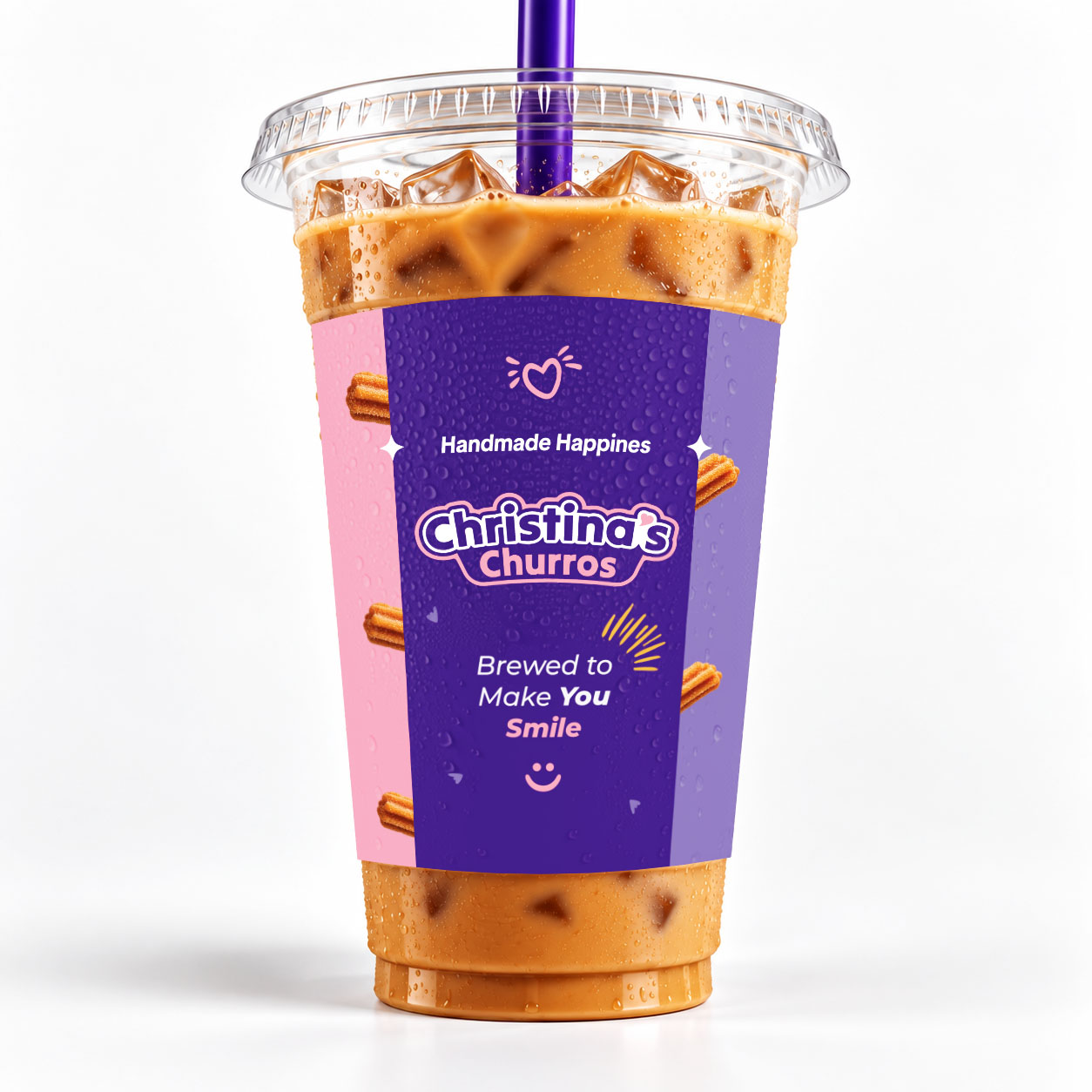
A cohesive set of branded materials created to extend Christina’s Churros identity across everyday customer touchpoints. Business cards, loyalty cards, cup stickers, and hot coffee sleeves all use the same playful color palette, typography, and graphic elements to keep the brand consistent, recognizable, and memorable.