Creating a
Visual Identity
for a Boba House
CASE STUDY
BOBA TEA
Project Overview
Kattea Boba House is a local bubble tea café founded by Kate, who turned her passion for bubble tea into her own business. The name Kattea combines her first name with the word Tea, creating a brand that feels personal and memorable.
Although the café already had a logo, the overall brand identity lacked visual consistency. The existing logo was based on a simple typeface with minimal customization, and the interior relied on neutral colors without any distinctive visual elements. While the space was clean and inviting, it didn’t create a memorable experience or communicate the personality of the brand.
Kate wanted to refresh the visual identity while keeping the original concept behind the name. Her goal wasn’t a complete rebrand, but a modern upgrade that would make the café feel warmer, more expressive, and instantly recognizable.
She envisioned a cohesive brand that could be applied across illuminated signage or vinyl wall graphics, menus, takeaway cups, packaging, and future marketing materials.
The new identity needed to create a more vibrant and inviting atmosphere while giving the café a distinctive and memorable visual presence.
To guide the design direction, Kate shared a preferred color palette inspired by nature and fresh ingredients:
- Soft sage green
- Dark Green
- Light blush pink
- Warm cream
- Soft lemon yellow
- White
These colors would help create a fresh, modern, and inviting environment while reflecting the calm and friendly character of the café.
CHALLENGE
The client knew the overall style they wanted but needed guidance in shaping the final identity. The goal was to refine their ideas into a professional, cohesive brand that balanced playfulness with simplicity.
BRAND STRATEGY
Brand Purpose
To create a welcoming place where people can enjoy high quality bubble tea in a fresh, friendly, and enjoyable atmosphere. Inspired by a genuine passion for bubble tea, the brand is built around sharing that experience with the local community.
Positioning
Bubble House positions itself as a modern, approachable bubble tea destination, offering quality drinks, a clean visual identity, and a memorable customer experience. The brand focuses on freshness, simplicity, and creating a place people want to return to.
Logo Design
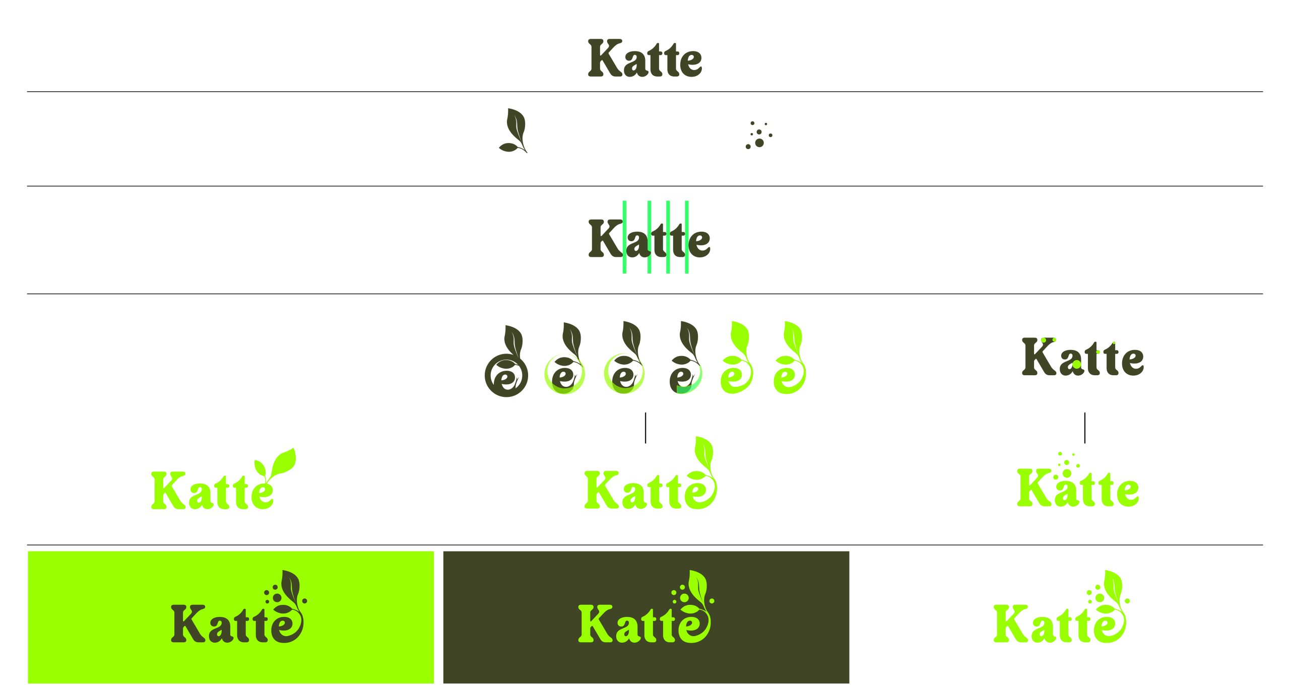
I presented Katie with three carefully selected typefaces to choose from, followed by three logo concepts based on her preferred font. After reviewing the options, she chose to combine two concepts integrating the leaf and bubble elements to create a clean, modern, and distinctive final logo.